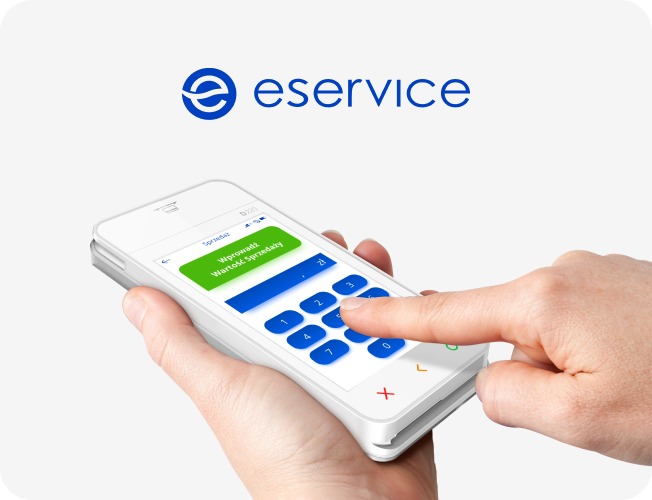

UX for Android PAX, Ingenico, and Sunmi Terminals
Summary
Comprehensive UX/UI system for Android-based payment terminals across 16+ device types — including merchant-operated SmartPOS, cardholder PIN pads, and unattended self-service terminals. Designed and maintained since 2017 for eService | Global Payments, deployed across 12+ European markets and multiple white-label brands. Built to meet European Accessibility Act (EAA 2025) requirements and WCAG 2.2 AA standards, integrating APCA contrast, extended touch targets, PCI/EMV constraints, and real-world transaction visibility — supporting operational reliability at scale.
Table of contents
- About the Client
- A Design Partnership Since 2017
- 16+ Terminal Types, One Consistent Experience
- a) Merchant-Operated POS Systems
- b) Cardholder-Facing PIN Entry Devices
- c) Unattended / Self-Service Payment Terminals
- UI Localisation for 5 brands
- Design Challenges and How We Solved Them
- a) Designing Across Screen Sizes and Form Factors
- b) Merchant vs. Cardholder UX
- c) EAA 2025 and WCAG 2.2 Accessibility
- d) PCI/EMV LED Indicator Integration
- Custom Icons & Splash
- Custom Vector Animations
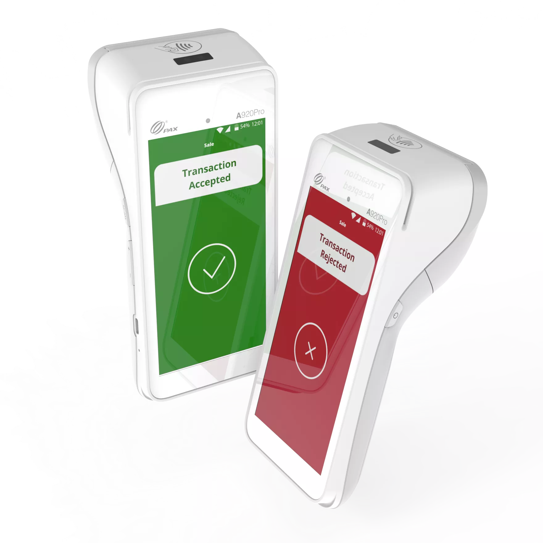
- Transaction Result Screens (and the challenge behind)
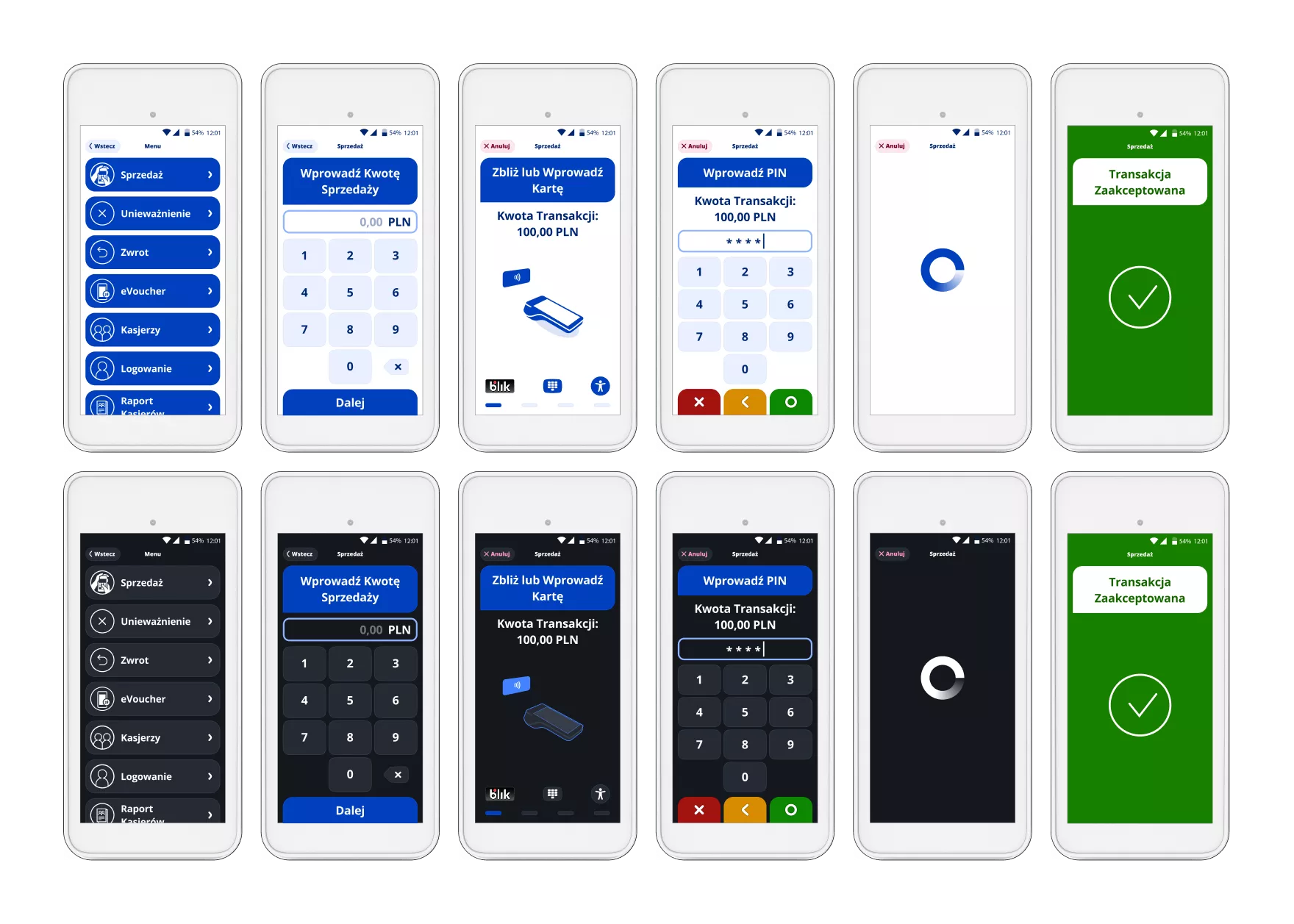
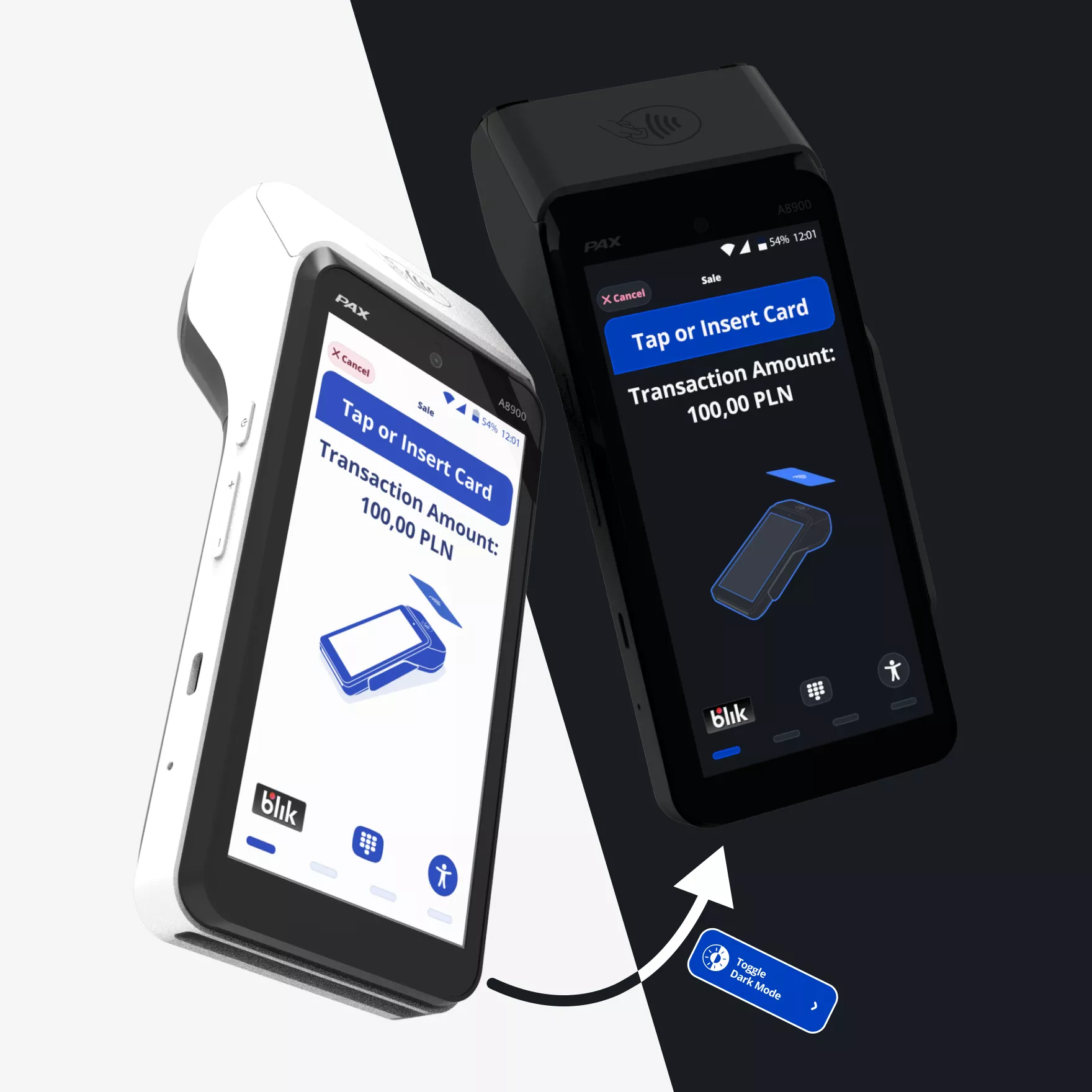
- Light Mode / Dark Mode
- Is the Client happy?
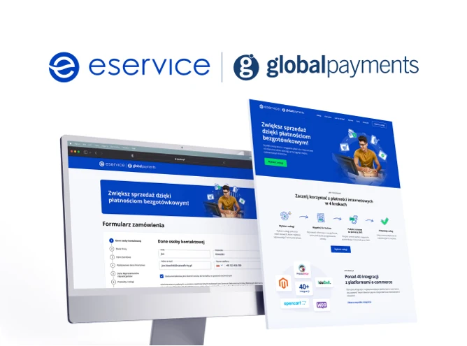
About the Client
eService is one of Central and Eastern Europe’s leading payment acquirers. The company is jointly owned by PKO Bank Polski — Poland’s largest bank — and Global Payments Inc., a global payments technology company headquartered in Atlanta, Georgia. In 2023, Global Payments completed the acquisition of EVO Payments , the former majority stakeholder in eService, and in 2024 announced its agreement to acquire Worldpay , further expanding its global merchant acquiring footprint.
Today, eService operates more than 530,000 POS terminals across 12+ European markets, processing billions of transactions annually for merchants ranging from independent retailers to enterprise-scale chains.
The terminals designed in this project are deployed across multiple brands within the broader Global Payments ecosystem, including eService | Global Payments, EVO, REVO, MONETA (MMB Platební služby), BOIPA (Bank of Ireland Payment Acceptance), and CardPay AA. While operating under local brand identities, these businesses leverage shared infrastructure, compliance frameworks, and payment technology from the Global Payments network.
A Design Partnership Since 2017
TeddyGraphics has been eService's design partner since 2017 — a collaboration spanning nearly a decade. What started with interface design for Ingenico Tetra terminals and the portable PAX D220 has grown into a comprehensive design engagement covering the entire terminal portfolio.
This particular project — the Android SmartPOS terminal family — began in 2021. The first version (v1.0) was released between 2021 and 2025, followed by a fully EAA 2025–compliant redesign that is currently deployed across all markets.
Beyond UX/UI, we support eService with the full spectrum of graphic design: custom iconography, vector animations embedded in the UI, product 3D renders, onboarding videos, marketing materials, event booth design, promotional videos, pamphlets, and social media assets. When we finish a product design, we stay to help the brand communicate it.
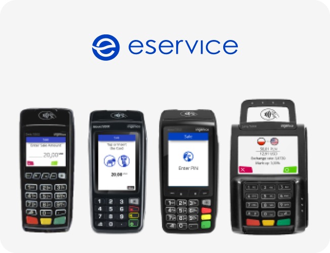
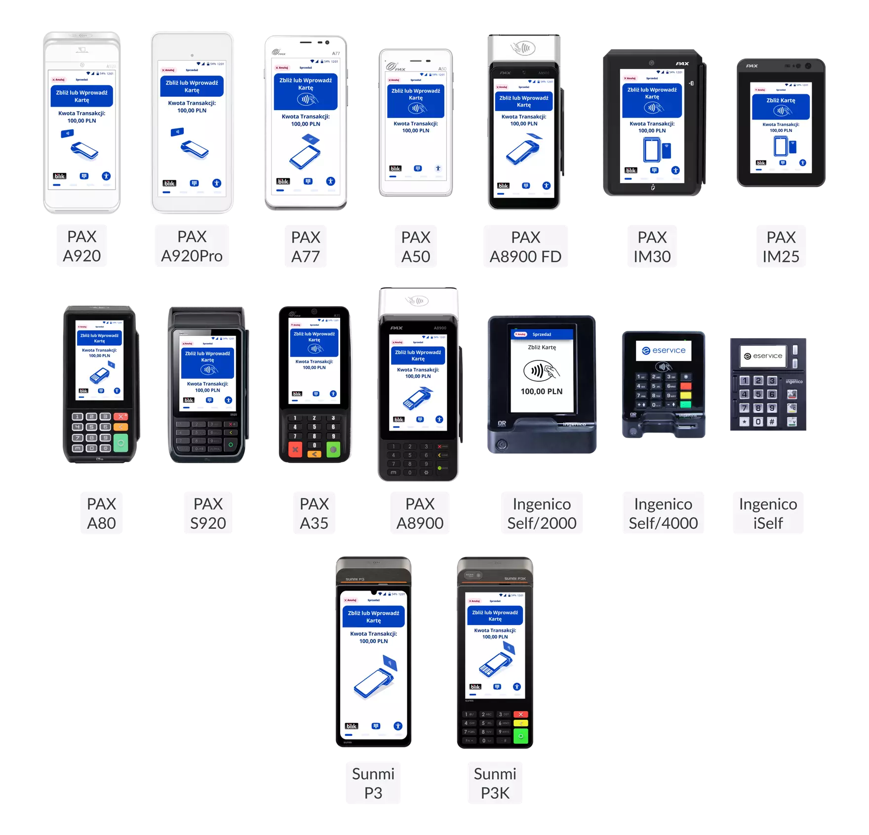
16+ Terminal Types, One Consistent Experience
The scope of this project spans the full range of payment terminal form factors — from handheld merchant-operated devices to large-screen self-service kiosks. Each terminal type presents distinct UX challenges, yet the interface language remains consistent across all of them.
Merchant-Operated POS Systems
Android SmartPOS — Mobile / Countertop (with printer)
- PAX A920 — All-in-one Android SmartPOS, portable or countertop, integrated printer
- PAX A920Pro — Enhanced A920 with higher performance, integrated printer
- PAX S920 — Mobile Android terminal with integrated printer
- Sunmi P3K — Mobile Android POS with physical keypad and integrated printer (5″ screen)
- Sunmi P3KH — Hardened version of P3K for demanding environments
Android SmartPOS — Countertop / Hybrid
- PAX A80 — Countertop Android POS with optional battery for semi-portable use
- Sunmi P3 Mix — Desktop Android POS with large 10″ display and integrated printer
Android SmartPOS — Mini / Lightweight (no printer)
- PAX A77 — Compact Android MiniPOS with touchscreen and scanner
- PAX A50 — Ultra-light mobile Android SmartPOS (phone-style form factor)
- Sunmi P3 — Large-screen mobile Android POS (6.75″), touchscreen-focused
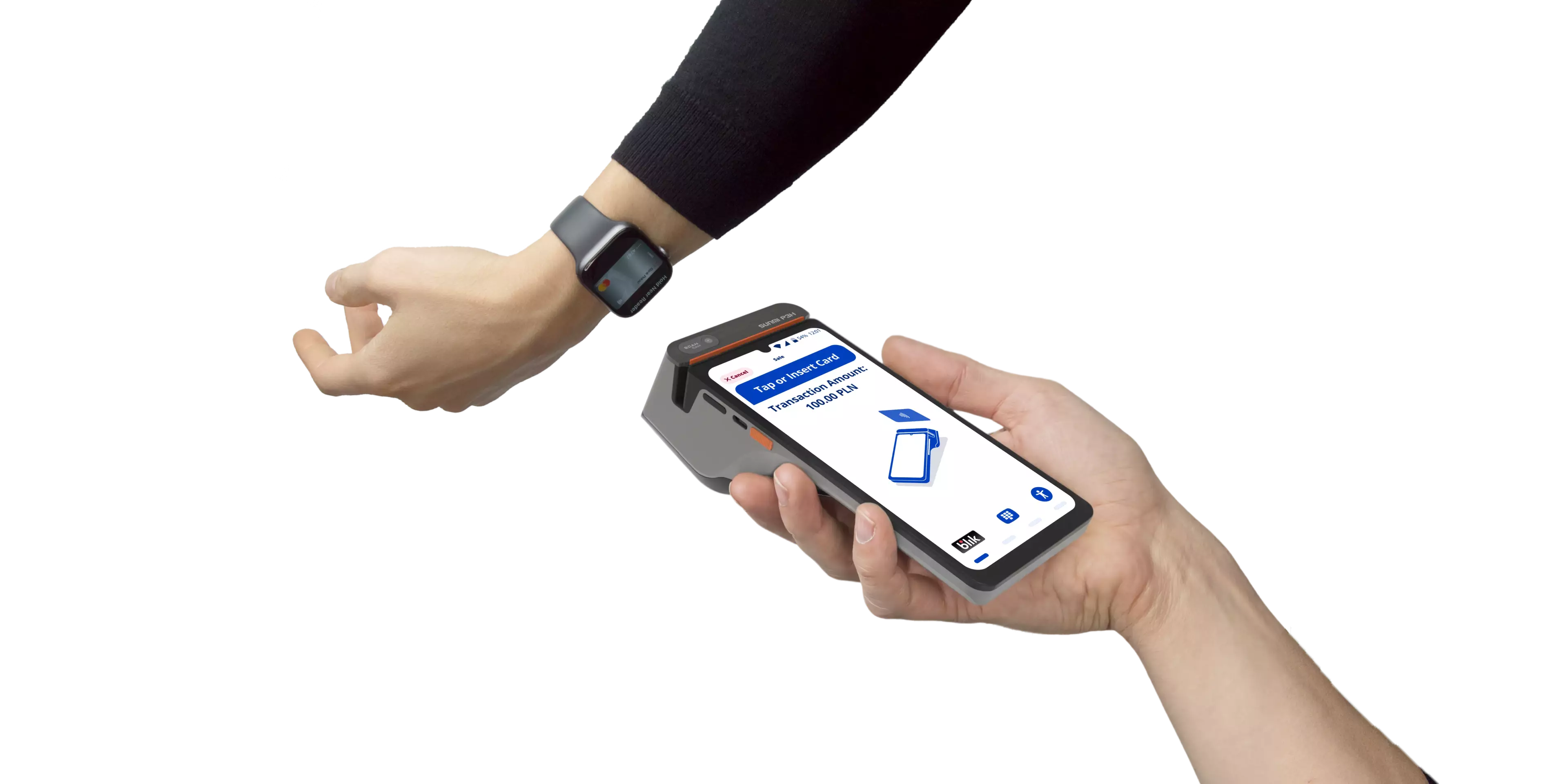
Cardholder-Facing PIN Entry Devices
Accessory devices connected to a POS or cash register, operated directly by the cardholder.
- PAX A35 — Android PIN pad for countertop PIN and contactless payments
- PAX Q25 — Advanced smart PIN pad with secure PIN and NFC acceptance
Unattended / Self-Service Payment Terminals
Designed for direct cardholder use in kiosks, vending machines, parking, EV charging, petrol stations, and more.
PAX
- PAX IM30 — Unattended Android payment terminal for kiosk and vending integration
Ingenico
- Ingenico Self/2000 — Compact unattended contactless terminal for self-service environments
- Ingenico iSelf Duo — Modular unattended PIN pad with card reader
- Ingenico iSelf Trio — Modular unattended terminal with PIN pad, chip reader, and NFC
3D Presentation from our YouTube Channel.
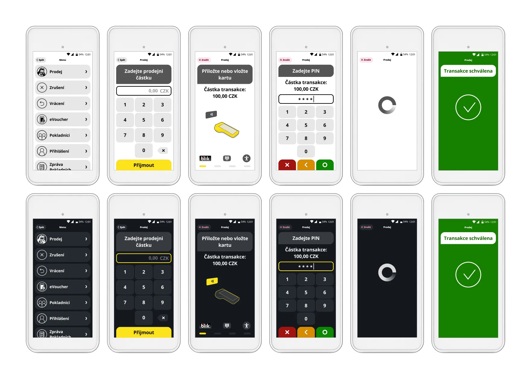
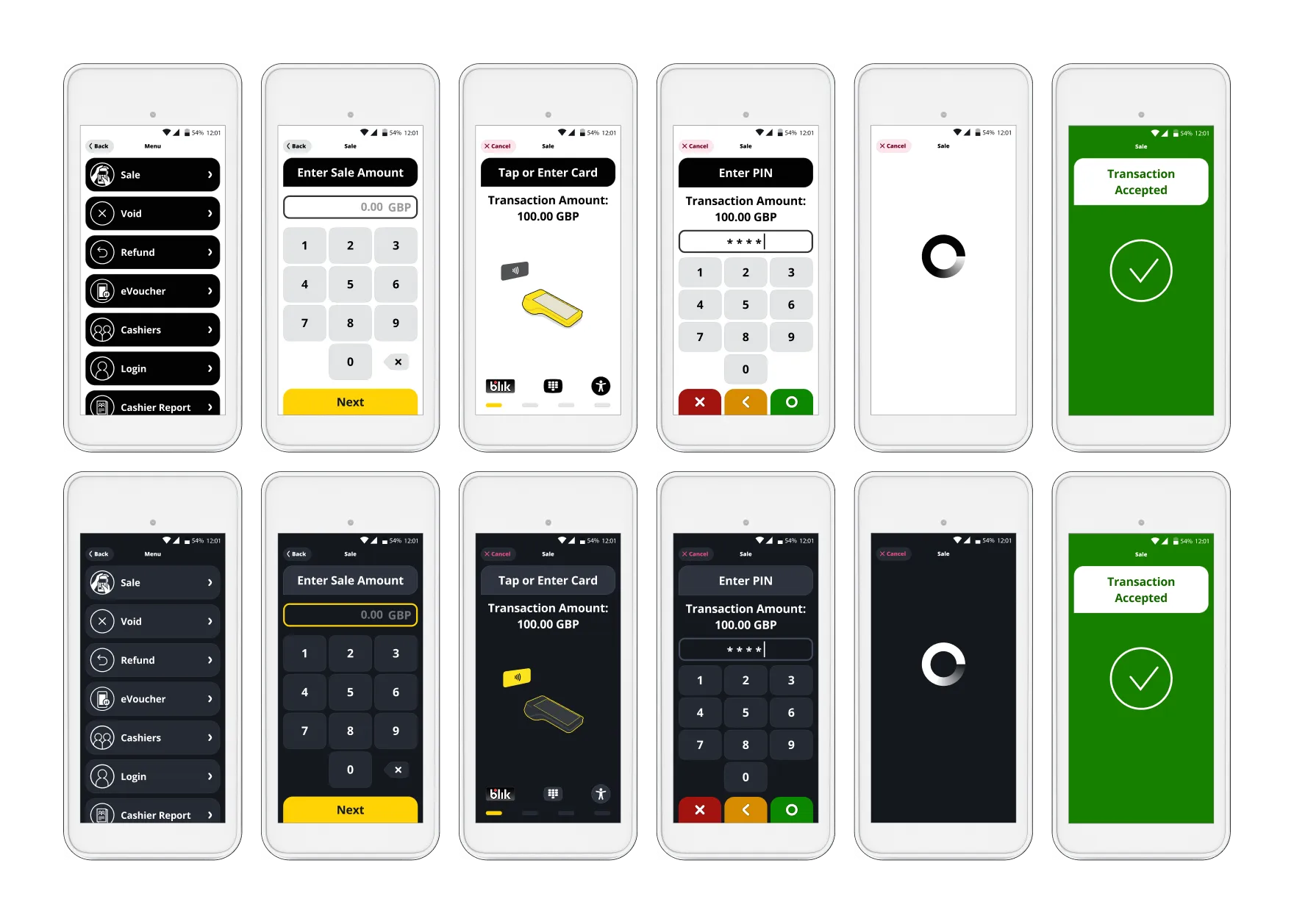
UI Localisation for 5 brands
Our UI has also been implemented across all Evo brands (Central-Europe). -Recolored with respect to each brand’s unique voice.
eService (Poland)
REVO (Czech Republic)
CardPay AA (UK)
MONETA (Czech Republic)
Bank Of Ireland Payment Acceptance and its UK-Division (Ireland & UK)
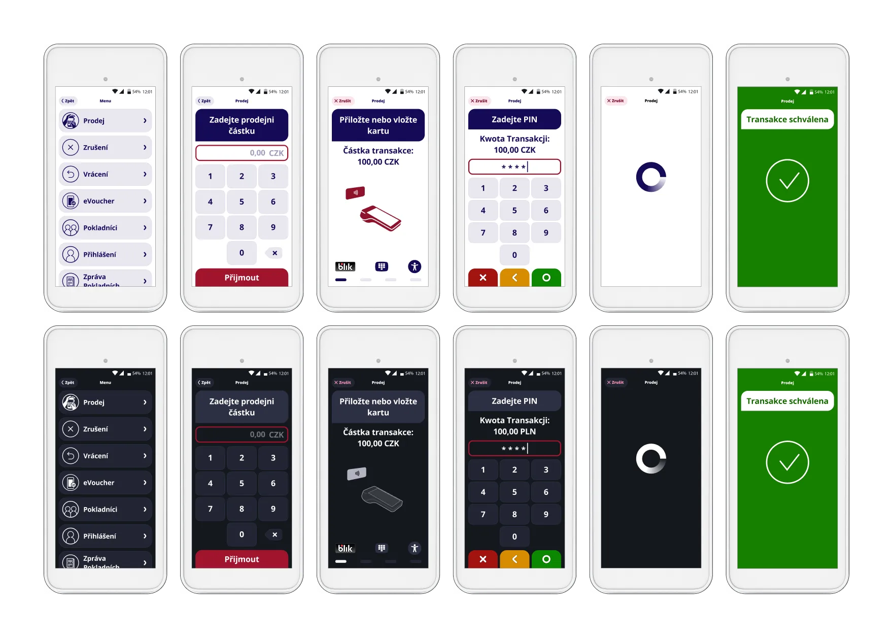
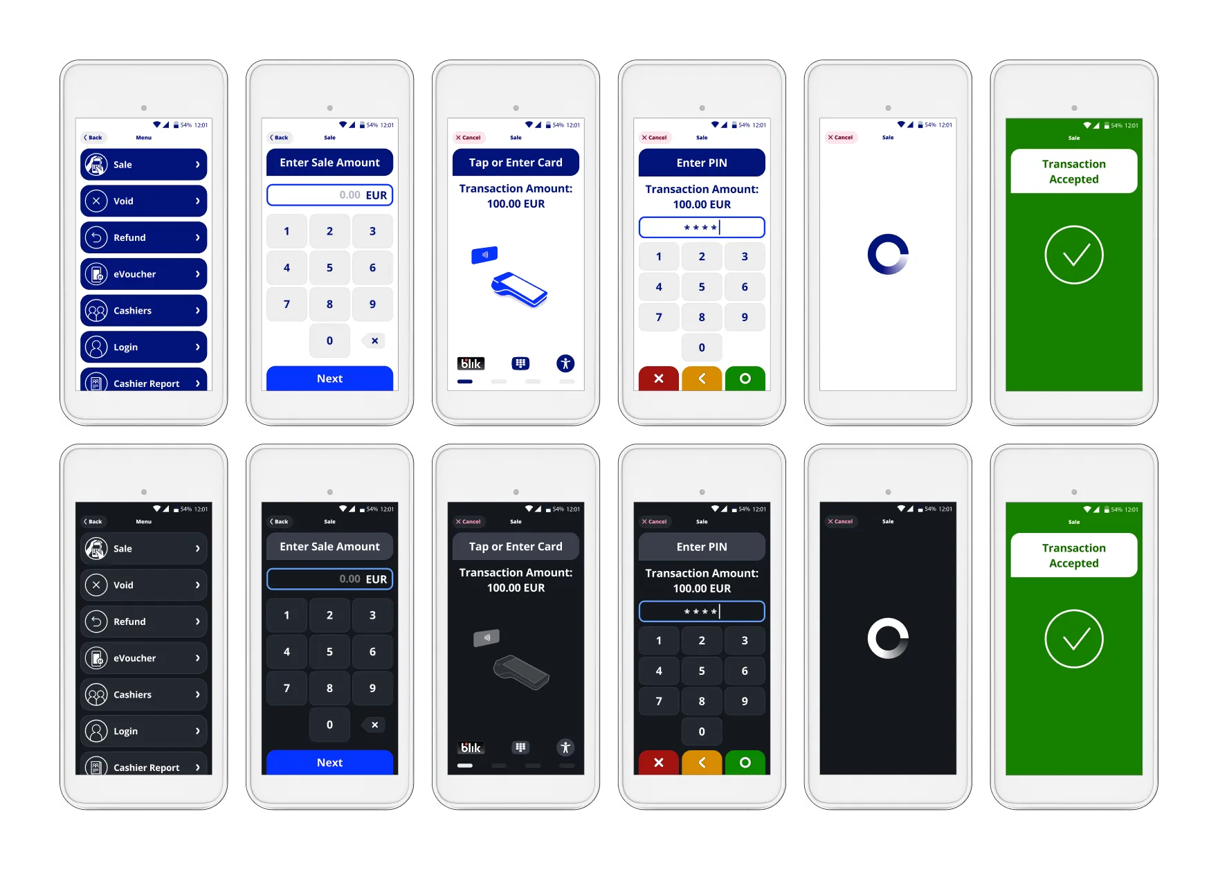
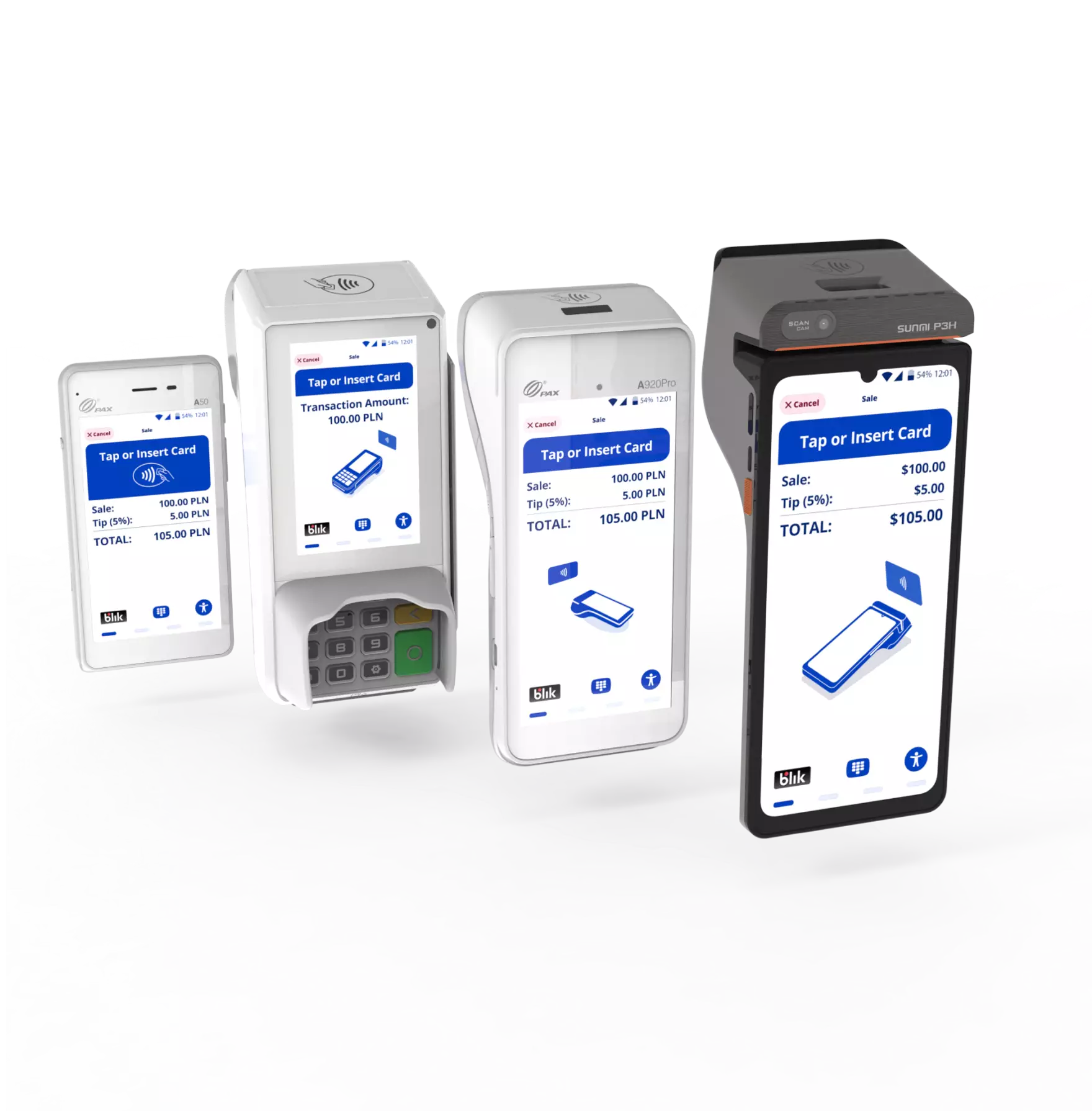
Designing payment terminal interfaces is fundamentally different from mobile app design. The UX constraints are unique to this domain, and getting them wrong has real-world financial consequences. The 16+ terminals in this project range from a 3.5″ PinPad screen (PAX A35) to a 10″ desktop display (Sunmi P3 Mix). Every UI element — buttons, typography, icons, animations — had to scale gracefully across this entire spectrum while remaining fully functional and legible. This is the iconic challenge of payment terminal design. Many screens serve a shared merchant + cardholder experience — the merchant initiates a sale, then hands the device to the cardholder for PIN entry or contactless tap. The UX needs to be immediately intuitive to cardholders who interact with these devices rarely and don't hold them close to their face. UI elements must be high-contrast, large enough to read from a distance, and self-explaining. For unattended self-service terminals (petrol stations, vending machines, parking), the challenge intensifies — there is no merchant to guide the cardholder through the flow. The entire experience must be self-explanatory, with clear visual cues for card insertion, NFC tap zones, and transaction progress. The current release is fully compliant with the European Accessibility Act (EAA) 2025 requirements and meets WCAG 2.2 at AA level. Our accessibility implementation includes: PCI and EMV certification require 4 physical LED indicators on the terminal. Our challenge was to integrate these LEDs into the UI so they feel native to the design — not like an afterthought bolted on for compliance. We positioned the LED indicator at the bottom of the screen, where it connects perceptually with the 2-decade legacy of these indicator lights that users subconsciously recognize, while staying clear of the NFC reader area so it doesn't get covered when users tap their card. Each item on the Menu list was enriched with a dedicated custom icon.
All animations in the UI are Vector-Based (super-crisp): It is challenging how to deal with the transaction rejection with delicacy. Our main challenges were: The transaction result is the most critical moment of the entire payment experience. The accepted and rejected states need to be instantly distinguishable — even from a distance, even in bright sunlight, even for users with color vision deficiency.
Our client reported real-world cases where merchants missed rejected transactions because the screen lacked sufficient contrast. We designed a high-contrast rejection screen that is unmistakable — bold, legible, yet not alarming to the cardholder standing nearby. Balancing delicacy with visibility required careful iteration.
Why we've made Rejection Screen red❓
Payment terminals operate in every environment — from sunlit outdoor terraces to dimly lit restaurant dining rooms. We designed both a Light Mode for bright environments and a Dark Mode for low-light settings, ensuring optimal readability and reduced eye strain for merchants who process hundreds of transactions per shift. [Translated from Polish] I highly recommend working with Piotr and the TeddyGraphics' team. We had the opportunity to collaborate on several complex UX projects related to payment applications—both mobile and running on payment terminals—and it was a very strong, partnership-based collaboration.
Design Challenges and How We Solved Them
Designing Across Screen Sizes and Form Factors
Merchant vs. Cardholder UX
EAA 2025 and WCAG 2.2 Accessibility
PCI/EMV LED Indicator Integration
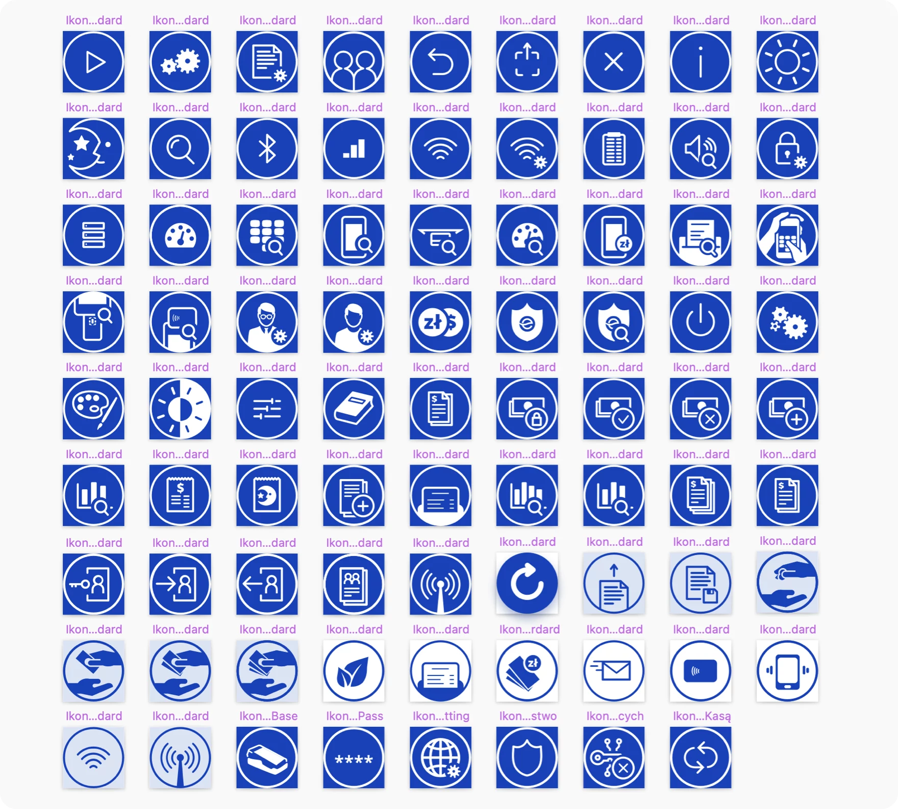
Custom Icons & Splash
To make things look even more custom, we have designed the app's Splash Animation and Launcher Icon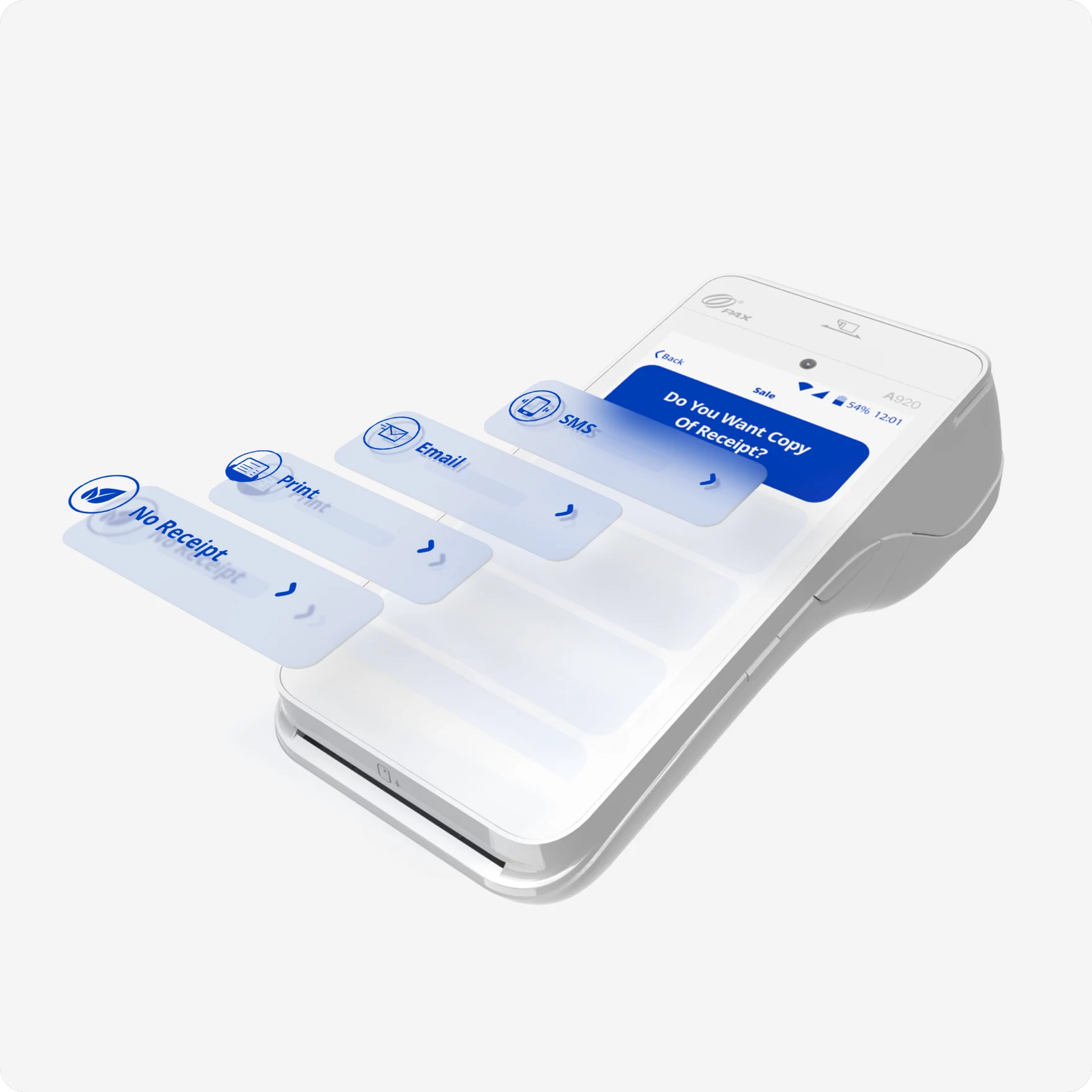
Custom Vector Animations
Transaction Result Screens
Piotr Wilk (our UX Lead) has talked about it with
Stéphane Joseph, on his "Think, Act, Lead" podcasting series.Light Mode / Dark Mode
Is the Client happy?

Michał Sodel / Product Manager @ eService | GlobalPayments
One of our joint initiatives included UX Writing for the eService Tom application, where we worked directly on XML files, translating and adapting the app’s navigation into Polish in line with UX writing principles used in eService payment applications, which we have been responsible for since 2017. Piotr’s experience in fintech projects was instrumental in delivering this scope with high quality, consistency, and alignment with industry best practices.
Another major area of our cooperation was a comprehensive UX/UI redesign of the entire eService payment application across all supported terminals (including PAX, Ingenico, and Sunmi) to meet the requirements of the European Accessibility Act 2025. This was an extensive and demanding project, involving multiple devices and hardware constraints, and Piotr with his team navigated this complexity very effectively.
Beyond his professional expertise, Piotr is an excellent collaborator—highly communicative, responsive, available, and open to feedback. He demonstrated creativity, deep domain knowledge, and strong attention to detail. I truly enjoyed working with him and confidently recommend him for UX projects, especially in the area of payment and fintech products.